Case Study
Building BCGK's Brand Identity from the ground up.
BCGK wasn't designed to fit the mold of ordinary multifamily syndication groups. The brand needed to evoke the values that ring true each and every day – Dynamic, Energetic, Confidence, and Professionalism.
 Multifamily Real Estate · Real Estate Investing · Single Family Signature Homes
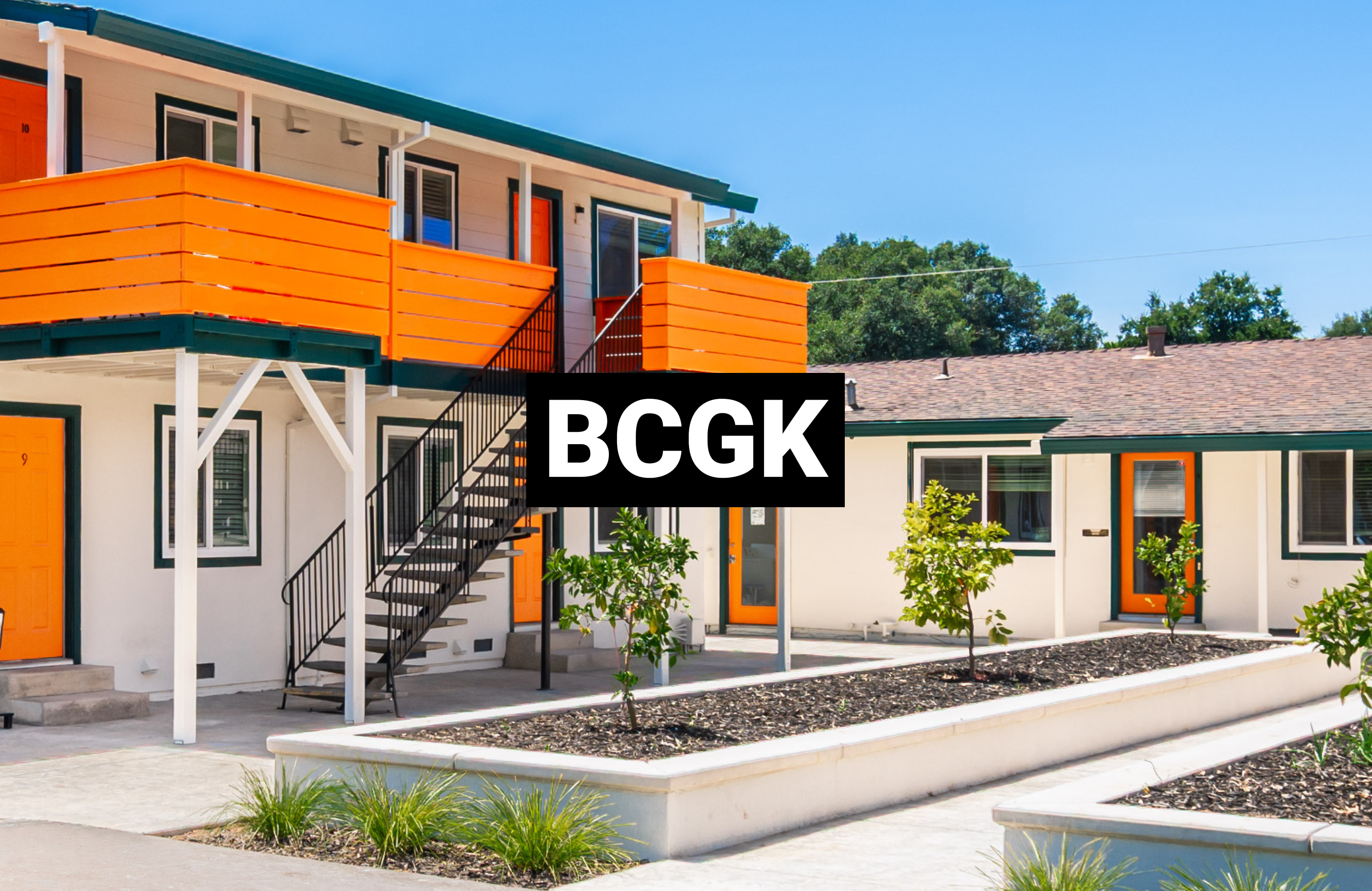
The Idea
The idea, no pastel colors or soft corners. BCGK is edgy, so leaning into the clean sharp corner edges of the brand is noticeable in key moments to capture attention. Black against white or white against black, the crisp neutral palette is simple and elegant.
The Problem
In the early days of the brand identity, too many colors and typography options were being used. The logo sizes weren't limited and it was a "free for all" on the Brand. Our team came in to implement constraints in the brand.
Solution & Design Approach
- Defined brand & tone of voice guidelines for BCGK.
- Applied brand guidelines to all digital experiences including corporate website, digital ads, videos, and social content.
- Visualized north star concepts on where the Brand can evolve to.
- Developed brand cohesive pitch decks to secure millions in investment dollars.
What We Learned
- →Lean into our dark theme, and expressing energy with vibrancy in our Call To Actions.
- →Avoid pastel colors, tints, or anything that may diminish the simplicity and elegance of a majority black and white brand.
- →Professional photography is the only way to show off the beauty of the properties!
Results
$10M+
Investment Raised
$28M
Assets Under Management
$25M
Assets Under Contract
Have a project in mind?
We'd love to help you design something that delivers real outcomes — just like we did for BCGK.